Ratis Camping: brand, business card & QR page
Name, logo, a print-ready business card and a three-language QR landing page for a fictional campsite on the Danube. Try it live: the page the card's QR code opens.
Problem
A new campsite on the Danube needs its first business card, but has nothing to put on it yet: no name, no logo, no colours.
Its guests are a mix of German, Dutch and international visitors, and they arrive with motorhomes and caravans as well as tents.
Solution
Name: Ratis, after Ratisbona, the Latin name of Regensburg. Short, easy to say in any language, and rooted in local history.
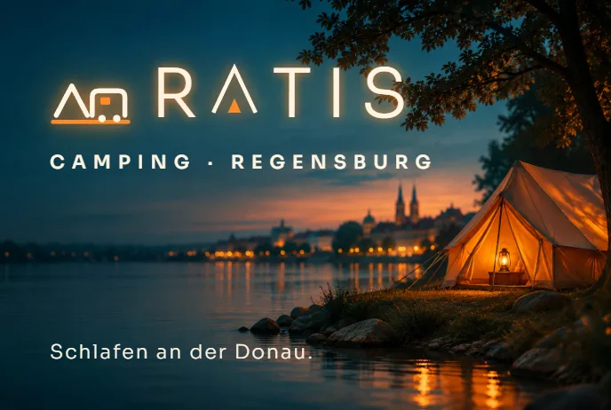
Wordmark: "RATIS", with the A drawn as a tent with a glowing door. Symbol: a tent and a motorhome on one shared line, still legible at 18 px.
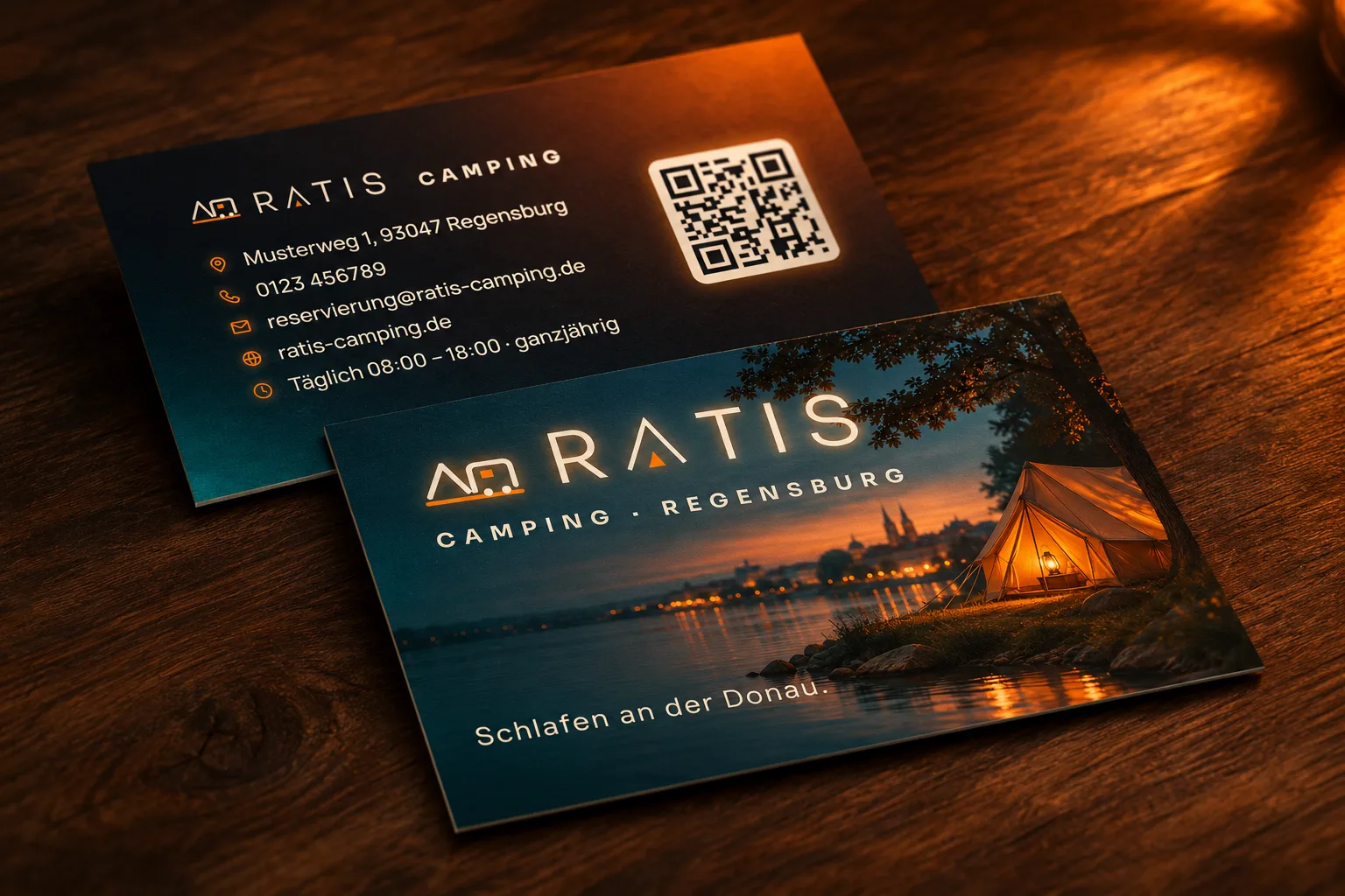
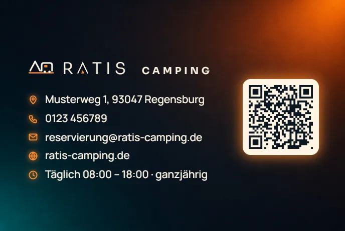
Business card: photo and logo on the front, contact details and a QR code on the back. Less text, more impact: icons instead of labels, so the card works without translation.
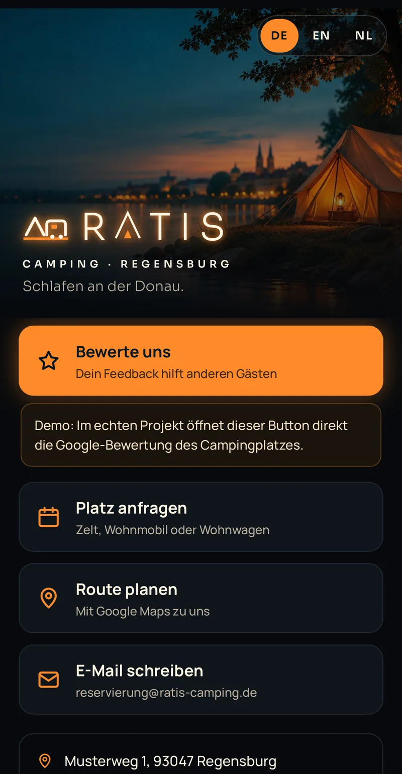
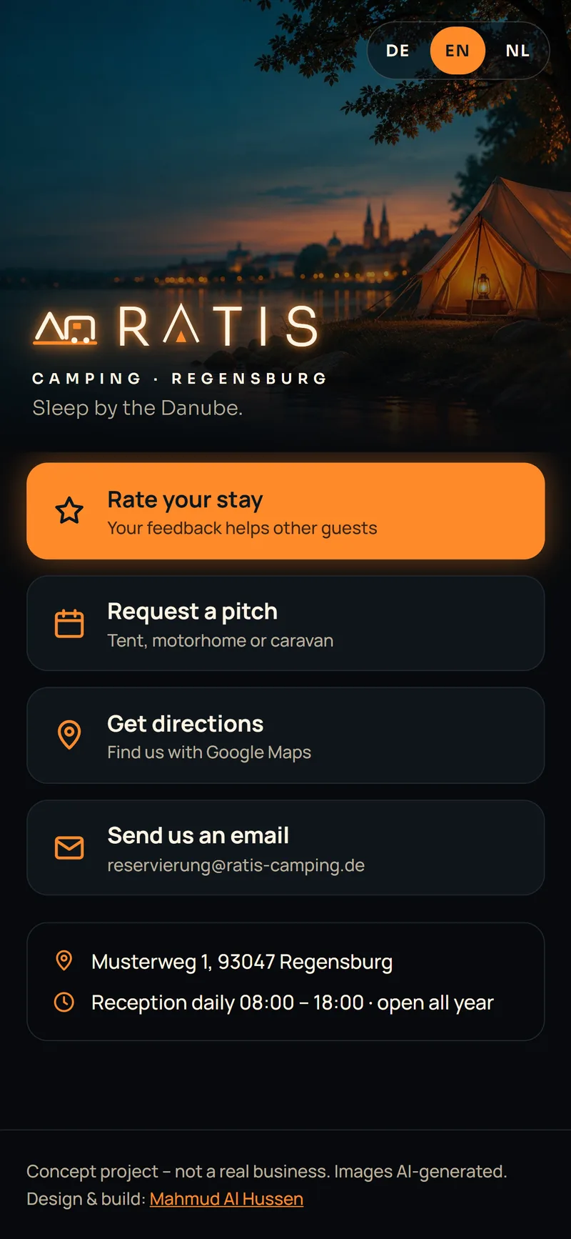
QR landing page: opens in German, English or Dutch depending on the phone's language, with four clear actions: leave a review, request a pitch, get directions, send an email. The QR code on the card really opens the demo page.
Print files: PDF with bleed, 300 dpi or more, all text inside the safe area.
Process
Briefing: a structured conversation with 23 questions, from contact details to budget. Two answers shaped the whole design. The card's job is to bring in more Google reviews and direct enquiries, so it gets a QR code instead of more text. Guests come with tents and motorhomes, so the logo can't just say "tent". Where the client had no answer (name, style, printing), I offered concrete options to choose from instead of repeating open questions.
Round 1, illustration: a hand-drawn Danube scene. Feedback: too playful, not professional enough.
Round 2, geometric, in two directions: clean shapes in black and orange. Feedback: tidy, but flat.
Round 3, photo look: a cinematic night shot on the Danube (AI-generated) with orange glow effects. This was the breakthrough.
Round 4, the logo: a bridge-arch idea was dropped, then six symbols were compared side by side. The pick: a tent and a motorhome on one line, so every guest feels addressed.
What I learned: when two drafts in a row are rejected, the drafts are rarely the problem; the shared picture of the goal is missing. Reference images from the client fixed that.
Glow works on screen, not on paper. In print it has to come from light in the photo or from a finish such as spot UV.
A logo is not a photo: the symbol stays simple and vector-based, and the "real" atmosphere comes from mockups and imagery.
Results
briefing questions, from contact details to budget
design rounds to the final solution
logo directions compared side by side
languages on the QR page (DE, EN, NL), picked from the phone's language
Tech stack
- Claude (design & build)
- ChatGPT
- HTML/CSS/JavaScript
- Print PDF (85 × 55 mm + 3 mm bleed)
Screenshots
Ratis Camping is a fictional concept project, not a real business. The photos and imagery are AI-generated. The address, phone number and domain are placeholders.